Updated November 4, 2026
Most Dubai business websites do not have a traffic problem as much as a leak problem. Visitors arrive from Google, a campaign or a link shared on WhatsApp, look for a few seconds, and leave without calling, messaging or filling in a form. UI/UX design is the work of finding where that happens and removing the reason.
This guide draws on how Lucidly works as a UI/UX Design Company In Dubai and focuses on the specific points where UAE business websites tend to lose enquiries, how to spot them in your own data, and how to check whether a fix actually worked.
For expert support with conversion-focused website strategy and UI/UX improvements, Message Lucidly on WhatsApp.
Quick Answer
Leads leak at predictable points: the first screen, navigation, service pages, trust proof, contact routes, forms, the Arabic version and page speed. UI/UX work targets these points rather than redesigning everything at once.
The phone is the main screen for most visitors: mobile accounted for 60.04% of UAE web traffic in September 2026, against 38.91% for desktop, according to StatCounter. B2B sites still need a strong desktop experience, so check your own device split.
Arabic is a second layout, not a translation: right-to-left pages need mirrored navigation, forms and icons, and room for text that runs longer or shorter than the English.
Contact routes need separate tracking: WhatsApp clicks, calls and form submissions behave differently and should be measured as separate key events.
Every change is a hypothesis: compare the same metrics, by device and language, before and after each change.

UI vs UX: The Short Version
UI (user interface) is what people see and touch: layout, typography, colour, buttons and form fields. UX (user experience) is how the visit works: whether people can find what they need, understand it and act on it without effort. On a business website the two cannot be separated, because a polished interface on top of a confusing structure still loses enquiries. For the wider picture of how UI/UX fits into a website project, see our guide on What Web Design Includes.
UI | UX | |
|---|---|---|
What it covers | Visual layout, type, colour, buttons, forms | Structure, navigation, journeys, friction |
The question it answers | Is the next step easy to see and tap? | Can the visitor find, understand and act? |
Example on a Dubai site | A WhatsApp button visible on mobile without scrolling | A service menu organised the way buyers search, not by internal department |
Where Dubai Business Websites Lose Leads
When we review business websites, most lost enquiries trace back to the same eight points. Each one below shows what usually goes wrong, what to check and what tends to fix it.
1. The First Screen Does Not Answer Three Questions
Within the first screen, a visitor should know what you do, who it is for and what to do next. Hero sections built around a slogan or a slider often answer none of these.
Check: open your top landing pages on a phone and ignore everything below the first screen. Could a stranger say what you offer and how to contact you?
Fix: a specific headline, one supporting line and one primary action that matches how your buyers prefer to start: a call, a WhatsApp message or a form.
Label the action by its outcome: “Book a 15-Minute Call” or “Request a Quote” tells visitors what happens next. “Submit” does not.
2. Navigation Is Built Around the Company, Not the Buyer
Menus often mirror internal departments or use labels only the team understands. The Dubai Design System usability guidelines call for consistent, predictable navigation with descriptive titles and links for exactly this reason.
Check: can a first-time visitor reach the right service page in two clicks? Do the menu labels use the words customers search with?
Fix: group services by customer need, keep labels plain, and add breadcrumbs on deeper pages so visitors always know where they are.
3. Service Pages Describe but Do Not Help People Decide
Many service pages list features and stop there. Buyers comparing providers in Dubai look for scope, proof, timelines and what affects the price before they enquire.
Check: does each key service page explain who it is for, what is included, what affects cost and what happens after the enquiry?
Fix: add a short what is included block, a relevant case study near the call to action and a plain explanation of what drives cost.
Use a familiar order: for most service pages, the problem, the service, how it works, proof and then the call to action is easier to follow than a list of features.
4. Trust Proof Sits in the Wrong Place
Reviews, client logos and certifications are often grouped at the bottom of the home page, far from the moment of decision.
Check: is there relevant proof within one scroll of every primary call to action?
Fix: place proof that matches the service next to the action it supports, such as a real estate case study on a real estate page or a healthcare client on a clinic page.
5. Contact Routes Do Not Match How People Reach Out
Some audiences prefer to message first, others want to call, and B2B buyers often still use forms. A site that offers only one route, or hides WhatsApp in the footer, makes part of its audience work harder. Our guide on Landing Page Design In Dubai looks at the messaging data in more detail.
Check: which routes do your visitors actually use, and which produce qualified leads?
Fix: give the strongest route the most visual weight, keep the others available and track each one separately.
6. Forms Ask Too Much or Break on Mobile
Form problems are among the easiest UX issues to measure. Baymard Institute research found that 61% of mobile sites do not use the correct keyboard type for one or more form fields, and 66% place tappable elements too close together.
Check: complete your own form on a phone, in both languages. Count the fields and note any that are not needed for the first reply.
Fix: remove non-essential fields, use the right keyboard for phone and email fields, mark required fields clearly, keep entered data when an error appears and make tap targets at least 24 by 24 CSS pixels, the WCAG 2.2 AA minimum.
Write errors that explain the fix: “Phone number must include the country code (+971)” helps the visitor finish. “Invalid input” makes them give up.
7. The Arabic Version Is an Afterthought
Arabic pages are often an English layout with translated text. The result can be icons that point the wrong way, misaligned form labels, awkward line lengths and a language switch that is hard to find.
Check: use the Arabic version the way a customer would, on a phone, from the home page to a completed enquiry.
Fix: design right-to-left layouts deliberately, mirror navigation and directional icons, test Arabic typography at small sizes and keep the language switch in the same expected place on every page.
8. Pages Are Slow or Jump While Loading
Speed is part of the experience. Google defines good Core Web Vitals as Largest Contentful Paint within 2.5 seconds, Interaction to Next Paint within 200 milliseconds and Cumulative Layout Shift of 0.1 or less, measured at the 75th percentile of visits.
Check: review Core Web Vitals for mobile and desktop separately in Search Console or PageSpeed Insights.
Fix: compress hero images and video, remove scripts that do not earn their place and reserve space for images and banners so content does not jump while the page loads.
Match the Symptom to the Likely UX Cause
Analytics will rarely tell you that the menu is confusing. It shows symptoms. This table links common symptoms to the leak point most likely behind them.
What you see in the data | Likely UX cause | Check first |
|---|---|---|
High exits on service pages and few clicks on the main call to action | The page does not help visitors decide | Points 3 and 4 |
Many mobile visits with very short engagement | First screen or page speed | Points 1 and 8 |
Form starts without submissions | Too many fields or mobile input problems | Point 6 |
Arabic pages convert well below English pages | A translated rather than designed layout | Point 7 |
Visitors reach the contact page but do not act | The contact route does not match their preference | Point 5 |
Visitors open the wrong service page from the menu | Navigation labels or grouping | Point 2 |
A Quick Example
This is a hypothetical example for illustration, not a client case study.
A Dubai clinic sees steady organic traffic to its treatment pages but few appointment requests. Analytics shows that most visits come from phones and that the Arabic pages convert well below the English ones. A short review finds the booking button below the first screen on mobile, a seven-field form without a phone keyboard and an Arabic form whose labels sit on the wrong side.
None of this needs a full redesign. Moving the booking action into the first screen, cutting the form to the fields needed for a first reply and rebuilding the Arabic form for right-to-left use are targeted fixes. The clinic then compares appointment requests by language and device over equal periods before and after the change.
A Real UAE Example: Avenew Development
For Avenew Development, a Dubai-based real estate developer, the main UX question was structural. The previous site lacked clear navigation and conversion paths, and investors needed to understand each development quickly. Lucidly built the information architecture around how property investors evaluate opportunities, organised the development pages logically, streamlined navigation to key project information and placed clear enquiry points along the way, inside a mobile-first layout that can scale as new projects launch.
The lesson for other businesses is that UI/UX improvement often starts with structure rather than visuals. When the path from interest to enquiry is clear, the interface has something solid to support.
How to Run a Quick UX Review Before You Redesign
Before committing to a redesign, a short review shows whether targeted fixes will be enough.
Define the actions that matter. Set up WhatsApp clicks, calls, form submissions and bookings as separate key events in Google Analytics 4.
Segment the data. Compare conversion by device, language and traffic source for your ten most visited landing pages.
Watch real behaviour. Use session recordings or heatmaps on the pages with the most traffic and the weakest conversion.
Walk the main journey yourself. On a phone, in Arabic and in English, go from a Google result to a completed enquiry and note every point of friction.
Rank the fixes. List the issues by likely impact and effort, and start with high-impact, low-effort changes.
Decide between fixing and rebuilding. If most issues are structural, or the platform cannot support the changes, a Website Redesign In Dubai is usually the better investment.
How to Measure Whether UI/UX Changes Worked
A UI/UX change should be judged by what visitors do, not by whether the site looks newer.
Metric | Where to find it | What it tells you |
|---|---|---|
Key event conversion rate by contact route | Google Analytics 4 | Whether more visitors act, and through which route |
Conversion by device and language | Google Analytics 4 segments | Whether one version is still holding results back |
Form starts compared with submissions | Google Analytics 4 form events | Whether the form itself loses people |
Engagement on key service pages | Google Analytics 4 | Whether visitors read and move toward action |
Lead quality | CRM or sales feedback | Whether more enquiries are also better enquiries |
Core Web Vitals | Search Console | Whether speed and stability improved |
Compare periods of the same length, change one major element at a time where you can, and allow for seasonal shifts such as Ramadan and the summer months, which can change traffic and demand in the UAE.
Common UI/UX Mistakes on UAE Business Websites
Redesigning for looks before fixing the journey. A new visual style on the same structure usually moves the same problems into a new template.
Copying a template built for another market. Contact preferences, languages and device mix in the UAE may not match the assumptions behind the template.
Treating Arabic as a translation task. Right-to-left use needs its own layout decisions.
Hiding the most-used contact route. If customers prefer to message first, that button belongs in the first screen on mobile.
Measuring only total leads. Without separate tracking by route, device and language, you cannot tell which change worked.
Adding pop-ups and sliders by default. The Dubai Design System guidelines advise keeping pop-ups to a minimum, and on mobile they often block the very action you want.
When to Bring In a UI/UX Team
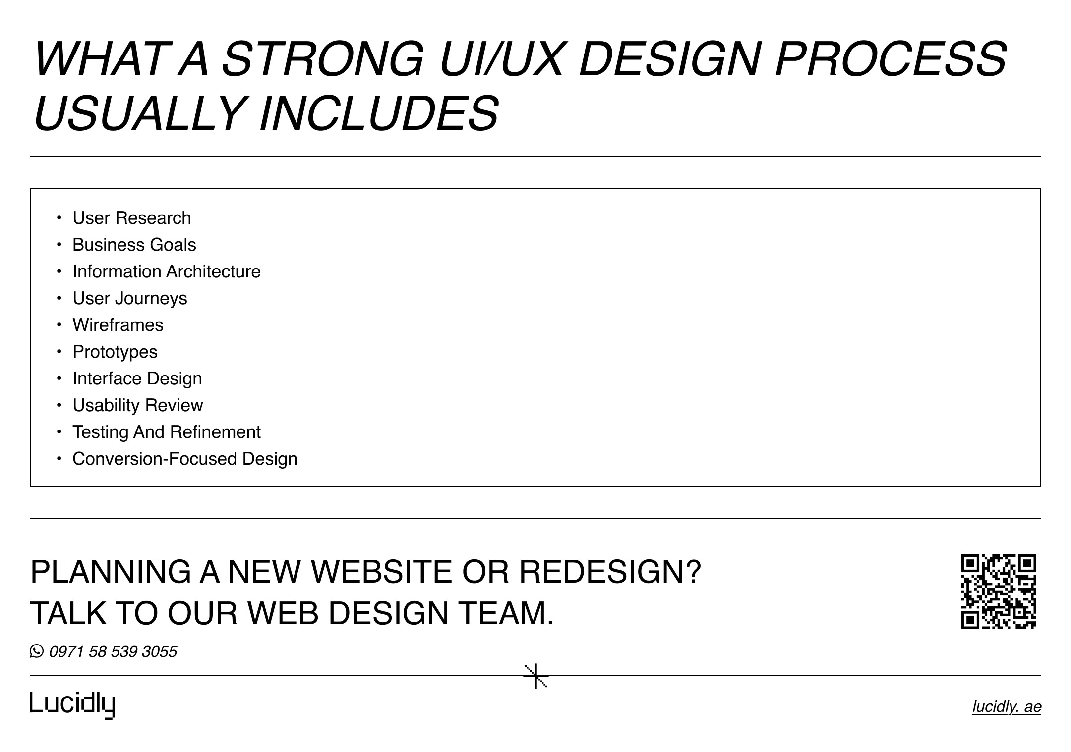
If the review points to structural problems, several journeys that need work or both language versions underperforming, a dedicated team will usually move faster than piecemeal fixes. A typical engagement covers research, information architecture, user journeys, wireframes, interface design and testing, and it should connect directly to development so decisions are not lost in the handoff. You can see how this works in our UI/UX Design Services In Dubai, which run as part of our wider Web Design Services.
Frequently Asked Questions
Can UI/UX be improved without a full website redesign?
Often, yes. A UX review can find the pages, forms and journeys that lose the most visitors, and targeted fixes there are faster than a rebuild. If the structure itself is the problem, a redesign is usually the better route.
Should a Dubai business website be designed in Arabic and English?
If your customers search and read in both languages, yes. Designing both versions from the start avoids an Arabic site that feels translated rather than planned, and keeps layouts and forms working in both directions.
How long does it take for UI/UX improvements to show in leads?
It depends on traffic. A site with steady traffic can show a clear pattern within a few weeks of a change, while lower-traffic sites may need two to three months of data before the difference is reliable.
Is UI/UX different for B2B and B2C websites?
The principles are the same, but the journeys differ. B2B buyers often compare several providers, involve more people and need more detail before they enquire, so service pages and proof carry more weight. B2C visitors usually decide faster and on mobile, so the first screen and the contact route matter most. For B2B sites, our guide on Corporate Website Design In The UAE covers what different stakeholders look for.
How much does UI/UX design cost in Dubai?
Cost depends on the number of page types, journeys and languages, and on how much research and testing the project needs. A focused UX review costs far less than a full website design. For the wider factors behind website pricing, see our guide to Website Design Cost In Dubai.
The Bottom Line
Better UI/UX improves leads in Dubai by removing friction at the few points where visitors decide whether to act: the first screen, navigation, service pages, proof, contact routes, forms, the Arabic experience and speed. Start with the data you already have, fix the biggest leaks first and measure each change by route, device and language.
Message Lucidly on WhatsApp for practical guidance on conversion-focused website design in Dubai, or use the phone numbers listed on the Contact Us page.