Responsive web design isn’t a nice-to-have anymore—it’s the baseline for usability, speed, and search visibility. Your audience moves between phones, tablets, laptops, and wide screens, often in the same buying journey.
If your site breaks or feels inconsistent on any device, you lose trust and conversions. A responsive website adapts layout, content, and interactions without hiding key information.
This guide explains what responsive design really is, why it matters in 2026, and how to implement it right for real results.
Message Lucidly on WhatsApp for a clear responsive design review—so your website works seamlessly on every device before you lock in a theme, builder, or custom build.
What Responsive Web Design Really Means
Responsive web design is an approach where a single website dynamically adapts to different screen sizes, orientations, and interaction methods.
Instead of creating separate versions for desktop and mobile, the same content and structure adjust fluidly to the user’s device.
At its core, responsive design is built on three key principles:
Fluid layouts that scale proportionally rather than relying on fixed pixel widths.
Flexible media, such as images and videos, that resize within their containers without distortion or overflow.
CSS breakpoints that adjust layout and spacing based on screen size or container context.
This approach differs from adaptive design, which switches between predefined layouts, and from separate mobile-only websites, which often introduce maintenance challenges and SEO risks. For most modern websites, responsive web design remains the most reliable and scalable solution.
learn more: What Is Web Development and How Does It Power Modern Business Websites?
Why Responsive Design Is Non-Negotiable in 2026
The way people access websites has changed faster than most businesses realize. What once worked as a “desktop-first” experience now struggles to meet users where they actually are—on phones, tablets, and mixed device journeys.
This shift has quietly turned responsive design from a best practice into a requirement. Understanding why it matters in 2026 means looking beyond aesthetics and into how usability, performance, and search visibility now intersect.
turn your website to responsive design with UX and UI Design for Business Websites: Principles That Improve Conversions
Users Don’t Browse on One Device Anymore
User behavior is fragmented. Someone might discover your site on mobile, compare options on a tablet, and convert on a desktop—or the other way around.
A site that feels inconsistent or frustrating on any device interrupts that journey.
Responsive design ensures visual consistency, predictable navigation, and readable content regardless of how users access your site.
That consistency builds trust, which directly affects engagement and conversion rates.
Mobile-First Indexing Makes Responsiveness an SEO Issue
Google primarily uses the mobile version of a website for indexing and ranking. This makes mobile experience the first version search engines evaluate—not a secondary one.
If your mobile layout causes any of the following issues, your rankings may suffer even if your desktop site looks perfect:
Important content is hidden or truncated on mobile.
Internal links are removed or less accessible.
Pages are oversimplified in a way that changes their meaning.
As explained in Google Search Central documentation, Google primarily evaluates websites through their mobile version, making mobile-first indexing a critical consideration for both usability and SEO.
Responsive web design helps maintain content parity, ensuring that both users and search engines see the same core information across all devices.
Ready to Build a High-Performance Website?
Turn strategy into results with Lucidly’s custom web development solutions — built for speed, SEO, and business growth.
👉 Book Your Web Development Consultation
Performance and Core Web Vitals Depend on Responsive Choices
Responsive design directly influences loading speed, layout stability, and interactivity—key components of Core Web Vitals.
Poorly implemented responsive layouts often cause:
Large images loading unnecessarily on mobile
Layout shifts when fonts or media resize
Delayed interactions due to heavy scripts
Google has confirmed through its Core Web Vitals guidance that loading performance, interactivity, and layout stability are key signals used to evaluate real user experience.
When responsive decisions are performance-aware, they support faster load times, smoother interactions, and more stable layouts—signals that contribute to better user satisfaction and stronger SEO performance.
learn more about: Website Performance: How Speed Affects User Experience and Conversions
The Hidden Costs of a Desktop-First Website
Many websites still look “fine” on desktop but quietly fail on mobile. These failures are subtle but expensive.
Common issues include:
Text that’s too small to read without zooming.
Buttons and links placed too close together for touch input.
Images and tables that overflow the screen.
Forms that are painful to complete on mobile.
Each of these increases friction. Friction increases bounce rates, lowers conversion rates, and wastes traffic from search and paid campaigns. A responsive website removes these barriers before users even notice them.
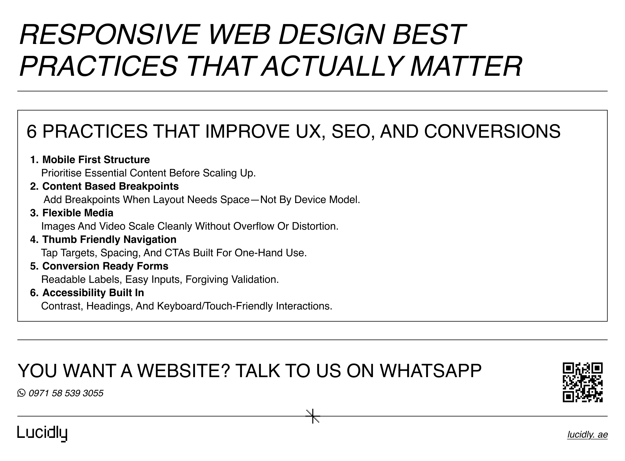
Responsive Web Design Best Practices That Actually Matter
Responsive design isn’t just about resizing a layout—it’s about making your site usable, fast, and consistent on every screen.
The best practices below focus on the changes that actually improve user experience, SEO, and conversions.
Start With Mobile-First Design
Designing mobile-first forces prioritization. It helps you focus on essential content, clear hierarchy, and efficient interactions before expanding to larger screens. Desktop layouts then become enhancements—not crutches.
Use Breakpoints Based on Content, Not Devices
Avoid designing for specific phone or laptop models. Instead, introduce breakpoints where the content naturally needs more space. This keeps layouts future-proof as new devices and screen sizes emerge.
Make Media Flexible and Performance-Friendly
Images and videos should scale within their containers without causing layout shifts. Use modern image formats, responsive image sizing, and lazy loading where appropriate to balance quality and speed.
Design Navigation for Thumbs, Not Cursors
Responsive navigation should be easy to use with one hand. Menus, calls-to-action, and interactive elements must be large enough, spaced properly, and placed where users can comfortably reach them on smaller screens.
Treat Forms as Conversion Assets
Forms are one of the first places responsive design breaks. Input fields, labels, and error messages must be readable, touch-friendly, and forgiving. A responsive form often converts better than a visually impressive one.
Accessibility Is Part of Responsiveness
Readable text, sufficient contrast, logical heading structure, and accessible interactions benefit everyone—not just users with disabilities. Accessibility improvements often lead to better usability across all devices.
Modern CSS Tools That Make Responsive Design Easier
Responsive design has evolved beyond basic breakpoints and fixed layouts. Modern CSS tools now allow designers and developers to build flexible, component-based experiences that adapt more intelligently to different contexts, not just screen sizes.
Media Queries: Still Essential, Still Relevant
CSS media queries allow styles to change based on screen size, orientation, or resolution. They remain the foundation of responsive layouts, especially for structural changes across viewports.
Container Queries: A Smarter Way to Scale Components
Container queries allow components to respond to the size of their parent container instead of the viewport. This is especially useful in modular layouts where the same component appears in different contexts.
Using container queries reduces brittle breakpoint logic and makes responsive systems more maintainable as sites grow.
How to Test If Your Website Is Truly Responsive
Responsive design isn’t proven by resizing a browser window once.
Effective testing includes:
Using browser developer tools to simulate multiple devices and orientations
Running Lighthouse audits to evaluate performance, accessibility, and SEO signals
Monitoring Core Web Vitals data to identify real-world usability issues
Testing should focus on critical pages first: homepages, service pages, landing pages, and conversion flows.
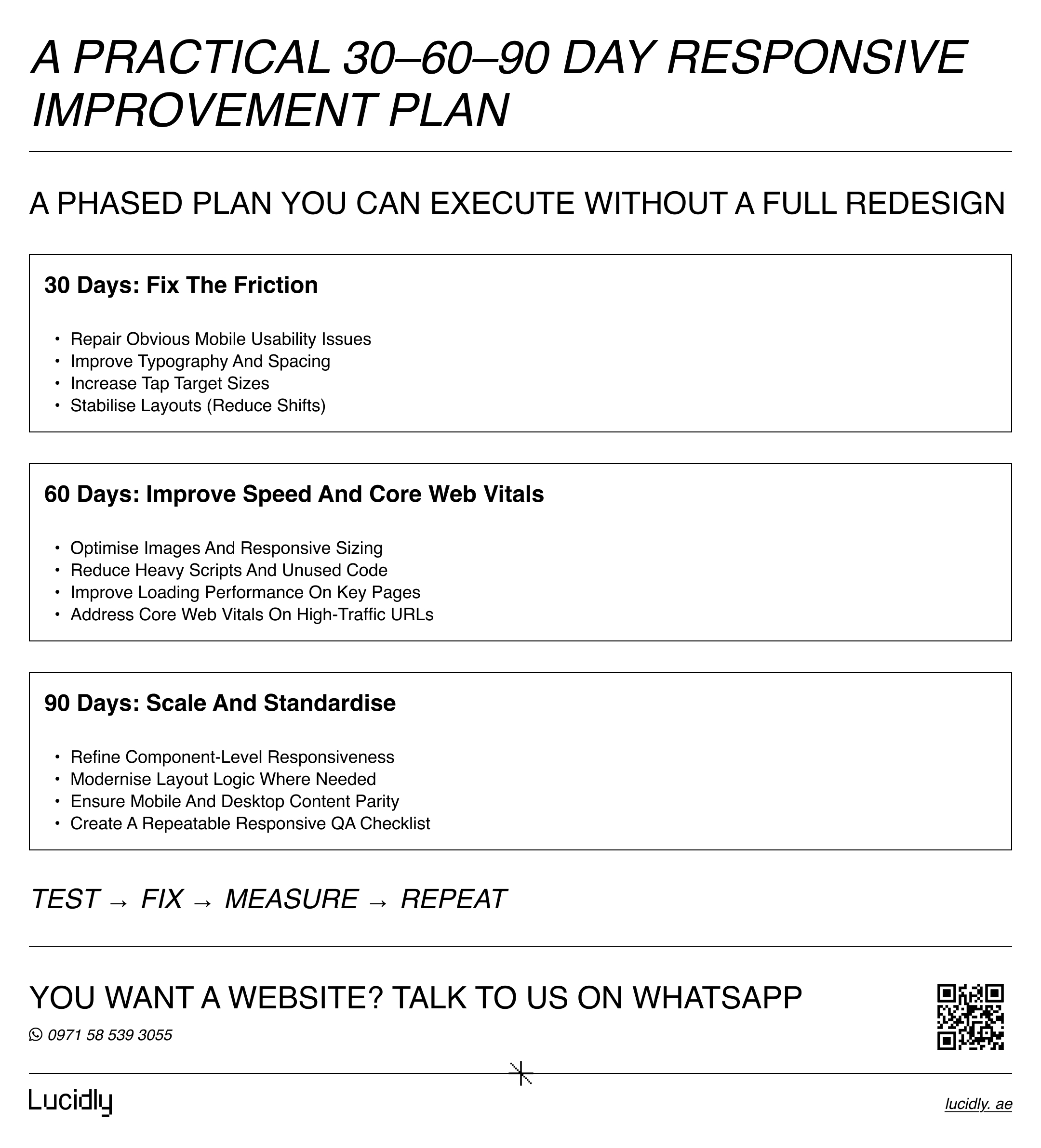
A Practical 30-60-90 Day Responsive Improvement Plan
Improving responsiveness doesn’t require a full redesign overnight. A phased approach allows you to fix critical usability issues first, then strengthen performance and consistency over time—without disrupting your existing site or business goals.
First 30 days:
Fix obvious mobile usability issues, improve typography, adjust tap targets, and stabilize layouts.
Next 60 days:
Optimize images, improve loading performance, and address Core Web Vitals on high-traffic pages.
By 90 days:
Refine component-level responsiveness, modernize layout logic where needed, and align mobile and desktop content fully.
Frequently Asked Questions
What is responsive web design in simple terms?
It’s a way of building websites so they automatically adapt to different screen sizes without needing separate versions.
Does responsive design help SEO?
Yes. Responsive design supports mobile-first indexing, content parity, and better user experience—all of which contribute to stronger search performance.
Responsive vs adaptive design: what’s the difference?
Responsive design fluidly adapts to any screen size, while adaptive design switches between fixed layouts.
How do I test if my site is responsive?
Use browser device simulators, Lighthouse audits, and real user performance data to evaluate usability and layout behavior.
Responsive web design isn’t about making a site “look okay” on mobile.
It’s about delivering a consistent, fast, and usable experience wherever your users are—while aligning with how search engines evaluate your site.
If your website doesn’t work seamlessly across devices, it’s not just a design issue. It’s a growth issue.
Contact us — or message Lucidly on WhatsApp for a responsive website review. We’ll pinpoint what’s hurting usability and conversions across devices and outline the fixes before you commit to a builder, WordPress, or custom code.
References
Google Search Central — Mobile-First Indexing Best Practices
MDN Web Docs — Responsive Design Basics and Media Queries
Google Chrome Developers — Lighthouse Overview