Responsive web design uae is no longer just a design feature. It is a practical requirement for businesses that want to perform well across today’s mobile-driven customer journeys.
A responsive website adjusts smoothly across different screen sizes, devices, and orientations, helping users browse without awkward zooming, sideways scrolling, or misplaced elements.
In the UAE, where a large share of traffic now comes from smartphones, a strong mobile friendly web design uae approach helps keep content readable, navigation clear, and calls to action easy to find.
For expert guidance on responsive websites and mobile-first user experience, Message Lucidly on WhatsApp.
Responsive Web Design in the UAE
In the UAE, responsive design is no longer only about making a website fit different screen sizes.
It is about creating a smoother user journey across mobile, tablet, and desktop while supporting clearer communication, easier navigation, and stronger action paths.
As mobile browsing continues to shape how users discover and judge businesses, responsive web design uae plays a direct role in usability, trust, and overall website performance.
Why Mobile-First Design Matters in Responsive Web Design UAE
Mobile-first design is non-negotiable for UAE businesses because it starts with the smallest screen and the most essential user actions before expanding the layout for larger devices.
This approach creates stronger clarity from the beginning and helps businesses define the mobile experience around what truly matters.
In the UAE, where smartphone traffic often shapes the first interaction with a brand, that clarity can directly affect trust, engagement, and conversion potential.
It helps businesses focus on:
what matters most to the user.
what users need to see first.
what should appear immediately on a phone screen.
how key actions can be completed with less friction.
That matters because many users may judge a business before ever reaching the desktop version of the site.
If the mobile experience feels slow, cluttered, or confusing, trust can drop early.
A strong mobile-first website design improves mobile usability, supports better page experience, and helps strengthen conversion rate by making browsing, enquiries, bookings, and service actions easier to complete.
How Poor Mobile Design Hurts Leads, SEO, and User Confidence
Poor mobile design can reduce website performance even when the site is still technically working.
In many cases, the problem is not visibility alone, but how the experience affects user behaviour and business results.
It often leads to:
higher drop-off before users take action.
weaker trust in the business.
lower conversion rate from mobile visitors.
poorer page experience and engagement flow.
In a market shaped by smartphone traffic, even small usability issues can create larger business problems.
That is why mobile friendly web design uae should be treated as a performance priority, not just a visual improvement.
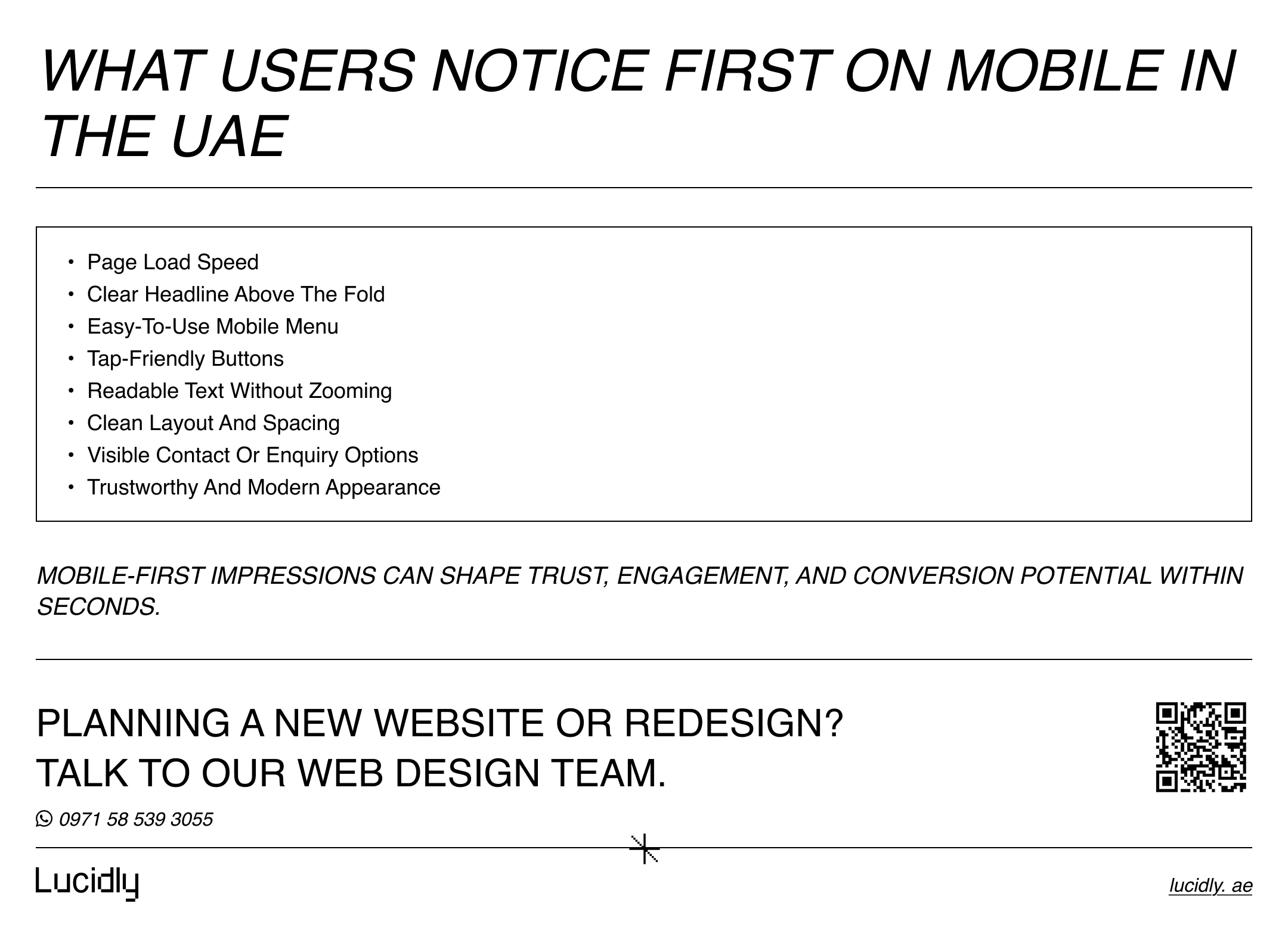
What Users Notice First on Mobile in the UAE
Mobile users in the UAE tend to make quick judgments. On a smaller screen, they often decide within seconds whether a website feels clear, trustworthy, and worth exploring further.
That is why strong responsive web design uae should prioritise the elements that shape first impressions most directly.
This is also why website companies in the UAE need to focus on mobile usability, not just visual presentation.
Responsive Website Design UAE vs Old Desktop-First Thinking
Many older website projects began with a wide desktop layout and only later tried to make it work on mobile.
That approach no longer fits how users browse in the UAE today.
A modern responsive website design uae strategy starts with the mobile visitor first, then expands upward for larger screens based on real user priorities and business goals.
Old desktop-first thinking | Modern responsive website design uae |
Starts with a wide desktop layout first | Starts with the mobile visitor first |
Treats mobile as a later adjustment | Treats mobile as a core part of the strategy from the beginning |
Often leads to crowded content and awkward navigation on smaller screens | Builds clearer structure and smoother navigation across devices |
Important actions may fall below the fold on mobile | Prioritises key actions early on smaller screens |
Focuses on how the site looks on large screens | Focuses on how the site works in real user situations |
Can look polished on desktop but underperform on mobile | Supports stronger usability across mobile, tablet, and desktop |
Sees responsiveness as a technical fix at the end | Builds responsiveness into the website’s logic from the start |
This shift matters because mobile visitors scan faster, abandon faster, and expect clarity sooner.
A business that still treats mobile as secondary often ends up with a site that looks polished on a large screen but underperforms where much of the real traffic actually happens.
Key Elements of Effective Responsive Web Design in the UAE
Effective responsive design depends on more than shrinking content to fit smaller screens. It requires a structured system that keeps the site usable, readable, and conversion-focused.
Flexible Grids That Adapt Across Devices
Flexible grids help the layout scale proportionally rather than breaking when screen size changes.
This allows sections, images, text blocks, and forms to reposition intelligently across devices. Without that flexibility, pages often feel unstable or visually uneven on mobile screens.
Breakpoints That Support Real User Experience
Breakpoints are the points where the design adjusts for different screen sizes. Good breakpoints are not just technical settings.
They directly affect how users read content, interact with menus, and move through the page. Poorly chosen breakpoints can create cramped layouts, strange spacing, or hidden content that damages usability.
Content Hierarchy for Smaller Screens
On mobile, there is less space and less patience.
That means the content hierarchy must be sharper. Headlines should communicate value quickly.
Important proof points should appear early.
Calls to action should be visible without making the screen feel crowded. Strong mobile first website design depends on disciplined prioritisation, not simply shorter pages.
Touch-Friendly Navigation and Forms
A site can look modern and still fail in practice if buttons are too small, navigation is hard to reach, or forms are frustrating to complete.
Strong mobile usability requires tap-friendly buttons, sensible spacing, simple form fields, and navigation that feels obvious without effort.
These elements are the foundation of responsive web design uae because they connect design decisions directly to user behaviour.
Is Adaptive Design UAE Still Relevant, or Is Responsive the Better Choice?
Some businesses also come across the term adaptive design uae when planning a new website or redesign.
In simple terms, adaptive design usually relies on fixed layouts prepared for selected screen sizes, while responsive design uses a more fluid approach that adjusts across a wider range of devices.
Adaptive design can still be useful in certain controlled situations. However, for most businesses, responsive design is the more practical and scalable option because it offers:
greater flexibility across different screen sizes.
easier long-term maintenance.
better support for new and changing device types.
stronger alignment with evolving user behaviour.
a more natural fit with a mobile-first strategy.
For most service businesses, ecommerce stores, and lead generation websites, responsive web design uae is the stronger long-term choice.
It supports broader screen variation, reduces maintenance complexity, and helps businesses build a website that performs more effectively across real user journeys.
How to Know If Your Site Is Truly Responsive
Many businesses assume their website is responsive just because it opens on a phone. That is not enough.
A truly responsive website should feel easy to use, clear to navigate, and consistent across different screen sizes.
Start by checking whether your site does the following:
keeps text readable without zooming.
allows easy one-hand navigation on mobile.
shows buttons clearly without crowding.
keeps contact forms simple and usable.
displays service pages and images properly.
maintains clean spacing between sections and elements.
adapts smoothly across different breakpoints.
makes key actions such as calling, messaging, browsing, or buying easy to complete
If the mobile experience feels harder, slower, or less clear than the desktop version, the responsive setup likely needs improvement.
A strong responsive website design uae standard should make the site work smoothly, not just appear on a smaller screen.
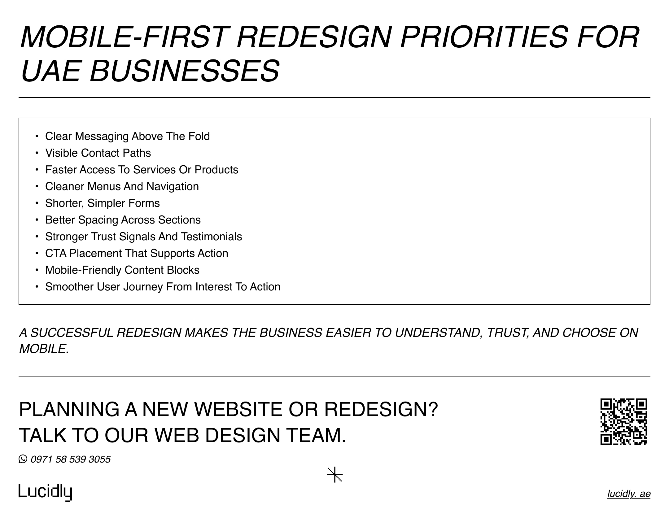
What UAE Businesses Should Prioritise in a Mobile-First Redesign
When planning a redesign, businesses should focus first on what mobile visitors need most. A strong mobile first website design approach should make the website easier to understand, easier to navigate, and easier to act on.
Key priorities often include:
clear messaging above the fold.
visible and easy contact paths.
faster access to products or services.
less clutter across important sections.
sharper content hierarchy.
shorter and simpler forms.
cleaner menus and smoother navigation.
better spacing between sections and elements.
stronger testimonial and trust placement.
CTA placement that supports action.
mobile-friendly content blocks that improve conversion rate.
A successful redesign does not just make the site look newer. It makes the business easier to understand and easier to choose. That is the real value of responsive web design uae.
FAQ
What is responsive web design?
Responsive web design is a design and development approach that allows a website to adapt across different screen sizes and devices.
It helps keep content readable, navigation clear, and user experience consistent whether the visitor is on desktop, tablet, or mobile.
Why is mobile-first design important in the UAE?
Mobile-first design is important in the UAE because many users discover, compare, and contact businesses through their phones first.
A weak mobile experience can reduce trust, engagement, and conversions before the visitor ever reaches the desktop version.
How do I know if my site is responsive?
You can check by testing your site on different screen sizes and devices. Review text readability, menu behaviour, button spacing, image scaling, form usability, and whether the layout adjusts smoothly at different breakpoints.
Do I need a separate mobile website?
In most cases, no. A separate mobile website usually creates extra maintenance and inconsistency. A well-built responsive website is typically the better solution because it keeps one unified experience across devices.
Responsive web design uae is no longer a design preference. It is a business requirement shaped by real user behaviour.
In a market where mobile browsing often drives first impressions, poor mobile execution quietly weakens trust, usability, and results.
Mobile-first design helps businesses create stronger page experience, better mobile usability, and a healthier conversion rate.
In the UAE, a website that does not work properly on mobile is not just outdated. It is actively limiting growth.
Need help improving your website’s mobile experience? Message Lucidly on WhatsApp or use the phone numbers on the Contact Us page.
References
Google Search Central. Mobile-first Indexing Best Practices.
MDN Web Docs. Responsive Web Design.
Nielsen Norman Group. Mobile and Tablet Design Resources.