A strong landing page design Dubai approach is not about appearance alone. It is about turning clicks into enquiries, bookings, or leads through a clear offer, a focused CTA, and a friction-free user journey.
Many pages fail because they try to say too much or guide users in too many directions. In practice, better results usually come from sharper messaging, better structure, and stronger relevance.
Read on to learn what makes a landing page convert better and what Dubai businesses often get wrong.
Message Lucidly on WhatsApp for guidance on building a high-converting landing page in Dubai.
Why Landing Page Design Dubai Matters for Conversion Rate and Lead Generation
A strong landing page design Dubai page helps users take one clear action without distraction. Instead of encouraging exploration, it supports one decision path.
This matters because conversion rate improves when the page is focused, relevant, and easy to act on. A weaker page often loses leads because the offer is unclear or the CTA is too easy to miss.
A Landing Page Should Be Built for One Goal
A landing page performs better when it is built around one objective. Too many competing actions usually weaken results.
A focused page should include:
One main offer.
One target audience.
One clear CTA.
One simple conversion path.
Why Conversion Rate Depends on More Than Design
A good layout helps, but design alone does not create results. Conversion rate also depends on clarity, relevance, and trust.
A stronger page usually benefits from:
A clear value proposition.
Relevant supporting copy.
Visible CTA placement.
Strong trust signals.
Smooth mobile usability.
Why Lead Generation Pages Often Underperform
Many lead generation pages underperform because they look polished but do not guide action well. The problem is often structural rather than visual.
Common causes include:
Weak headlines.
Poor CTA placement.
Too many choices.
Weak above the fold content.
Mismatch between ad and page message.
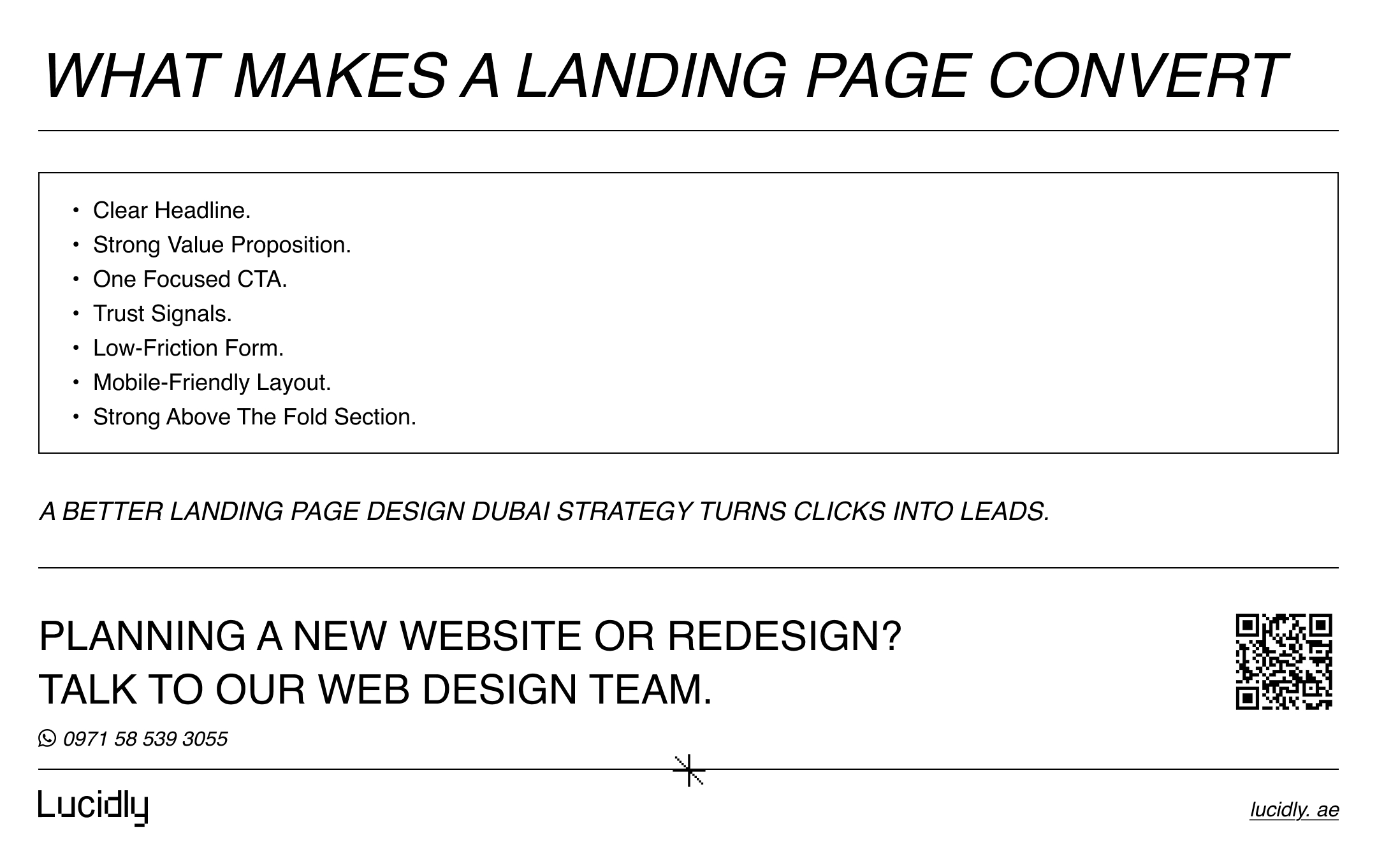
What Makes a Landing Page Convert Better
A better responsive landing page design Dubai page converts because it makes the value clear and the next step easy. Strong pages reduce hesitation instead of adding extra complexity.
A Strong Offer and Clear Message
The page should explain the offer quickly. If visitors do not understand what they are getting, they are less likely to act.
A strong message usually includes:
A clear headline.
A short supporting statement.
Direct audience relevance.
A visible user benefit.
A Focused CTA That Stands Out
The CTA should be obvious and specific. A strong page does not dilute action by presenting several equal choices.
A better CTA is usually:
Easy to see.
Clear in wording.
Repeated when needed.
Aligned with the offer.
Above the Fold Content That Answers Fast
The above the fold section should help visitors understand the page within seconds. It should reduce uncertainty before the user scrolls.
A strong above the fold section usually includes:
A clear headline.
A short value proposition.
One primary CTA.
One trust signal.
One relevant visual or form.
Trust Signals That Reduce Hesitation
Trust matters when the page asks users to submit details or take a commercial action. The page should make the offer feel safer and more credible.
Useful trust signals include:
Testimonials.
Client logos.
Review snippets.
Certifications.
Clear proof points.
Less Friction Means Better Conversion Rate
A strong conversion rate often depends on how easy the page feels to use. Complicated layouts and long forms create resistance.
A lower-friction page usually means:
Shorter forms.
Cleaner spacing.
Fewer distractions.
Clearer content flow.
Better mobile usability.
How Is Landing Page Design Different from Website Design
A landing page is built for one action. A website supports broader browsing, multiple journeys, and more than one type of user intent.
That difference changes the structure, the navigation, and the content priorities.
Element | Landing Page | Website |
Main goal | One conversion action. | Multiple user journeys. |
Navigation | Minimal or removed. | Full navigation. |
CTA | One main CTA. | Several possible CTAs. |
Content style | Short and focused. | Broader and layered. |
Best use case | Campaign traffic. | Brand and information hub. |
To understand the broader role of structure, usability, and visual clarity, read Lucidly’s guide on what web design is.
If you want to understand the broader role of structure, usability, and visual clarity beyond a single landing page, this connects directly with our article What Is Web Design? Why It Matters, What It Includes, and How It Affects Business Growth.
Why a Conversion Focused Landing Page Dubai Should Remove Distractions
A focused page converts better when it keeps attention on one action. Extra links and extra decisions weaken that focus.
Common distractions include:
Full navigation menus.
Unrelated links.
Multiple offers.
Competing CTAs.
Unnecessary sections.
Why Website Design and Landing Page Design Serve Different Intent
A website helps people explore. A landing page helps people decide.
That is why a landing page should prioritise:
Speed of understanding.
Clarity of offer.
Faster action.
Stronger campaign relevance.
Do I Need Separate Landing Pages for Ads
In many cases, yes. Sending paid traffic to a general page often reduces relevance and makes the journey less focused.
A separate campaign page usually works better when the ad promotes one specific offer, service, or audience promise.
Why Ad Traffic Should Not Always Go to a General Website Page
A general page often contains too much information for campaign users. That weakens clarity and slows action.
Ad traffic usually responds better to:
Stronger message match.
Faster clarity.
One focused offer.
One clear CTA.
When a Campaign Landing Page Dubai Makes More Sense
A separate campaign page is usually the better option when the business is promoting one defined action.
This often applies to:
Google Ads campaigns.
Service-specific offers.
Consultation campaigns.
Launch promotions.
Local lead generation ads.
When You Need Multiple Landing Pages Instead of One
One page is not always enough. Different audiences and different offers often need different conversion paths.
You may need separate pages for:
Different services.
Different audiences.
Different traffic sources.
Different ad groups.
Different CTAs.
What Should Be Above the Fold on a Landing Page
The first screen shapes the user’s first judgment. It should explain the value quickly and make the next step obvious.
The Core Elements of an Above the Fold Section
A strong above the fold section usually contains:
A clear headline.
A short value proposition.
One main CTA.
One trust signal.
One supporting visual or form.
What to Avoid Above the Fold
Weak above the fold sections often confuse users before they understand the offer.
Avoid:
Vague headlines.
Too much text.
Multiple CTAs.
Irrelevant visuals.
Cluttered layouts.
Why Above the Fold Matters in Landing Page Design Dubai
Users decide quickly whether a page is worth their attention. The first section should reduce doubt and increase clarity.
This matters most for:
Mobile users.
Paid campaign traffic.
Time-sensitive offers.
High-intent visitors.
Landing Page Design Dubai Elements That Improve Conversion Rate
A strong page improves conversion rate when its content, structure, and visual flow support the same action.
Headline and Subheadline Clarity
The headline should communicate value quickly. The subheadline should support it without repeating it.
A clearer message usually feels:
Direct.
Relevant.
Specific.
Easy to scan.
CTA Placement and Wording
CTA placement affects whether users act at the right moment. Good wording also reduces hesitation.
Better CTA performance usually depends on:
Strong wording.
Visible placement.
Clear user benefit.
Low action friction.
Trust Signals and Proof
Proof helps users feel more confident in the decision. It is especially important when the page asks for details or commitment.
Useful proof elements include:
Testimonials.
Client logos.
Review snippets.
Numbers.
Certifications.
Form Design for Better Lead Generation
A lead form should ask only for necessary information. When a form feels too demanding, users often leave.
A better form is usually:
Short.
Clear.
Easy on mobile.
Connected to a visible benefit.
Mobile UX for a High Converting Landing Page Dubai
A high converting page should work smoothly on smaller screens. Weak spacing and difficult forms often damage results quickly.
Important mobile factors include:
Readable text.
Easy button tapping.
Short sections.
Fast loading.
Simple form flow.
Visual Hierarchy and Scannability
A page should guide the eye in a natural order. If everything competes equally, users have to work too hard.
Better visual hierarchy usually comes from:
Clear headings.
Smart spacing.
Strong contrast.
Logical section order.
Better grouping of content.
How A B Testing Improves Landing Page Design Dubai Performance
A strong landing page should continue improving after launch. Testing helps identify what actually increases conversions.
What You Should Test First
Testing should start with the elements most likely to affect user action.
Start with:
Headline.
CTA text.
Form length.
Hero section.
Trust signal placement.
Why A B Testing Works Better After the Core Structure Is Right
Testing works best when the page already has a solid structure. It cannot fix a page that is unclear at a strategic level.
Before testing small details, fix:
Message clarity.
Offer relevance.
CTA logic.
Mobile usability.
What Not to Change All at Once
Too many changes at once make results harder to interpret. Testing should isolate major variables.
Avoid changing:
Headline and CTA together.
Form and layout together.
Offer and audience message together.
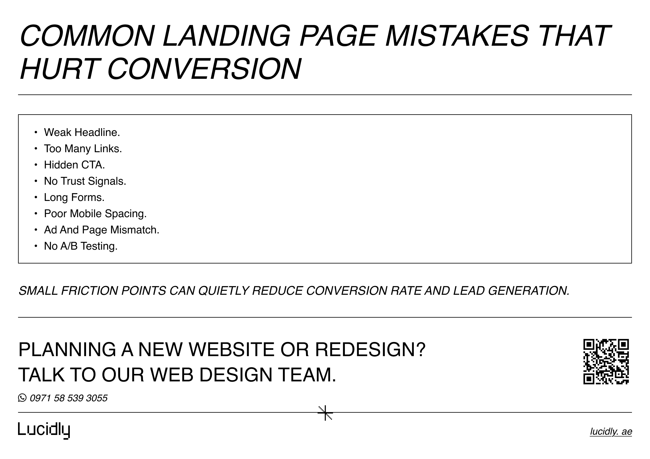
Common Landing Page Design Dubai Mistakes That Hurt Conversions
Many pages fail because they create friction exactly where the user needs clarity.
Common mistakes include:
Weak headline above the fold.
Too many links.
Hidden CTA.
No trust signals.
Long forms with no clear value.
Generic content.
Poor mobile spacing.
Mismatch between ad and page.
No A/B testing after launch.
If you want to explore the broader thinking behind high-performing digital experiences, explore Lucidly’s web design services.
How a Landing Page Design Company Dubai Should Approach Conversion
A strong process should begin with strategy before visuals. The page should be designed around offer clarity, audience intent, and lead generation flow.
Strategy Before Visuals
Before design starts, the page should define:
The offer.
The audience.
The CTA.
The traffic source.
The desired conversion.
Message Match Between Ad and Page
The user should feel they landed in the right place immediately. Strong message match reduces confusion and improves trust.
Lead Generation Flow and CTA Logic
A strong page should guide the user from interest to action without unnecessary delay.
That usually means:
Clear section order.
Visible CTA placement.
Short form logic.
Strong supporting proof.
Why a Landing Page Designer Dubai Should Think Beyond Layout
Good design is not just about arrangement. It is about clarity, friction, trust, and action.
If you want to see how better UI/UX design improves user experience, leads, and sales, read our guide: UI/UX Design in Dubai: How Better Website Design Improves Leads and Sales.
FAQ
What makes a landing page convert better?
A strong page converts better when it combines a clear offer, one strong CTA, useful trust signals, strong above the fold content, and low friction across the page.
How is landing page design different from website design?
Landing page design focuses on one conversion action, while website design usually supports multiple pages, journeys, and goals.
Do I need separate landing pages for ads?
Often yes. Separate pages usually perform better when each ad targets a specific service, audience, or offer.
What should be above the fold on a landing page?
A strong above the fold section should include a clear headline, a short value proposition, one CTA, and one trust signal.
A successful landing page design Dubai strategy is not about adding more elements. It is about making the page clearer, faster, and easier to act on.
The pages that convert better usually do fewer things more clearly. They improve message match, strengthen the CTA, reduce distractions, and support trust.
That is what makes a conversion focused page more effective for lead generation.
Message Lucidly on WhatsApp for practical guidance on creating a conversion focused landing page Dubai businesses can use to generate better leads, or use the phone numbers listed on the Contact Us page.
References
Google Ads Help. Landing page experience. (Google Help)
Google Search Central. Creating helpful, reliable, people-first content. (developers.google.com)